Wasilla Museum Logo Design
The Wasilla Museum selected me to help with their rebranding and new logo design. The tagline “Share, Remember, Engage” guided the design process and new visual identity. The museum includes historical and cultural exhibits, visitor center resources, a gift shop, and is the home of Night at the Museum and the Wasilla Community Block Party.
From the new brand guidelines:
“The Wasilla Museum’s logo serves as the visual foundation that unites and propels the brand’s vision with a conceptual, effective mark. The icon is constructed of a circle with radiating lines from a central point.
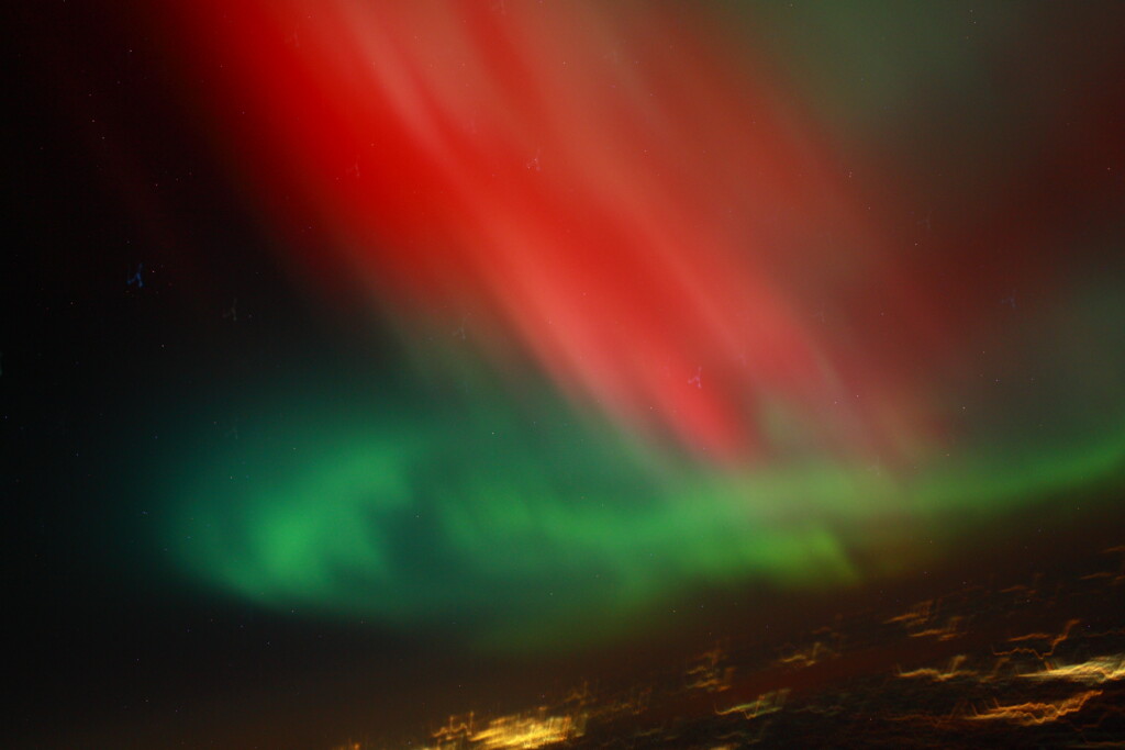
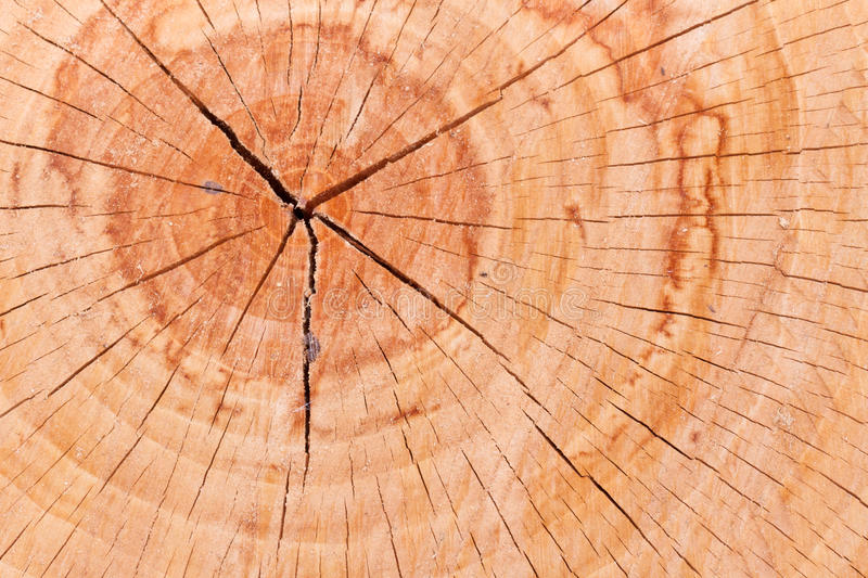
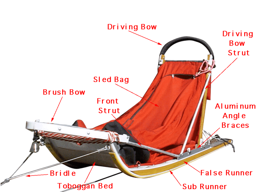
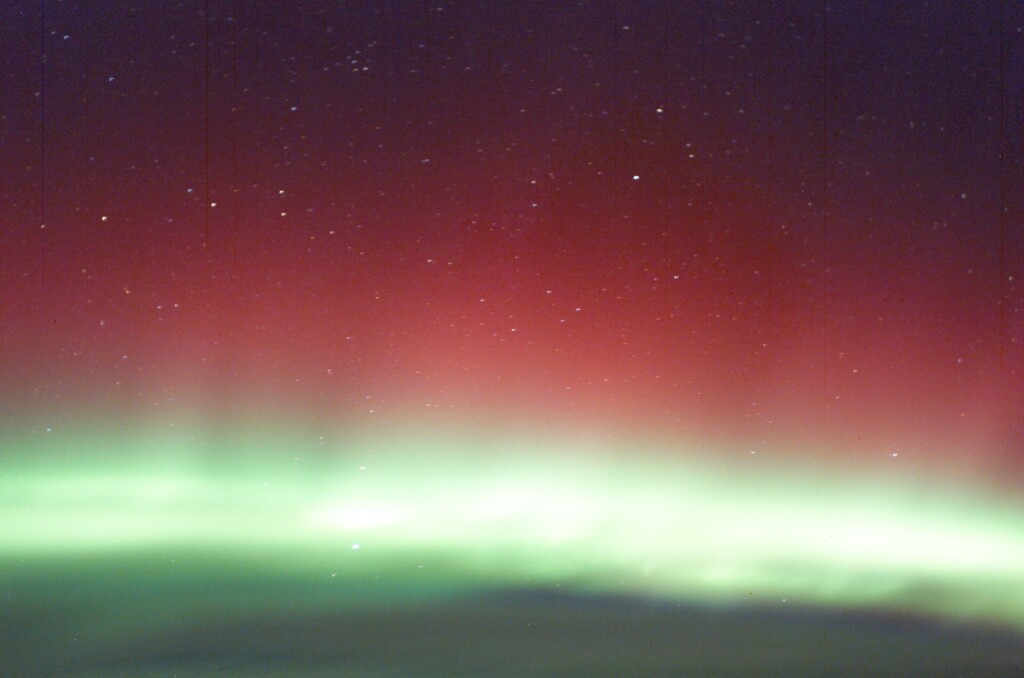
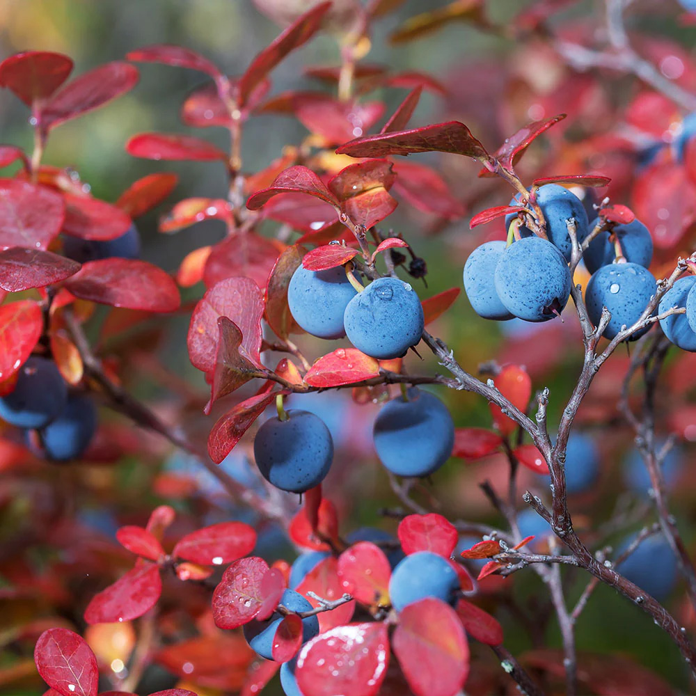
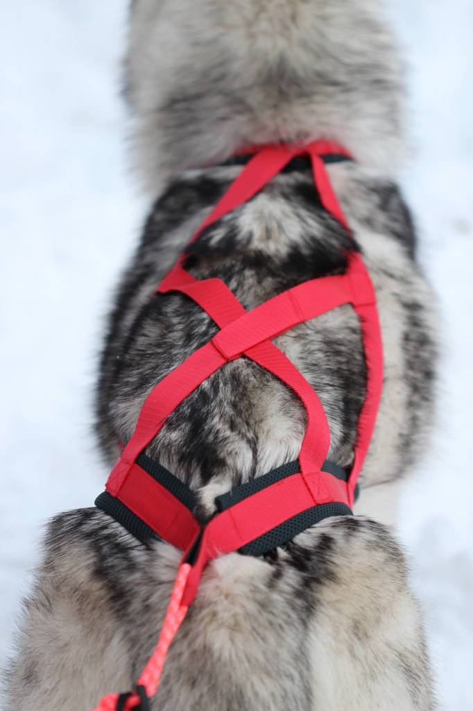
As an abstract mark, the logo can be imagined as multiple concepts: the wheels of a train, the summer flowers, sunrise or sunset, a mountain range, vibrant red aurora in a winter sky, parts of a sled dog team’s harness, and Wasilla as the center with branches to the larger community. The interaction of the viewer with this mark reinforces the vision of the Wasilla Museum to use stories and imagination to foster community. Bold and vibrant colors are used to complement the logo and reinforce its character.”
Sketches & Inspiration
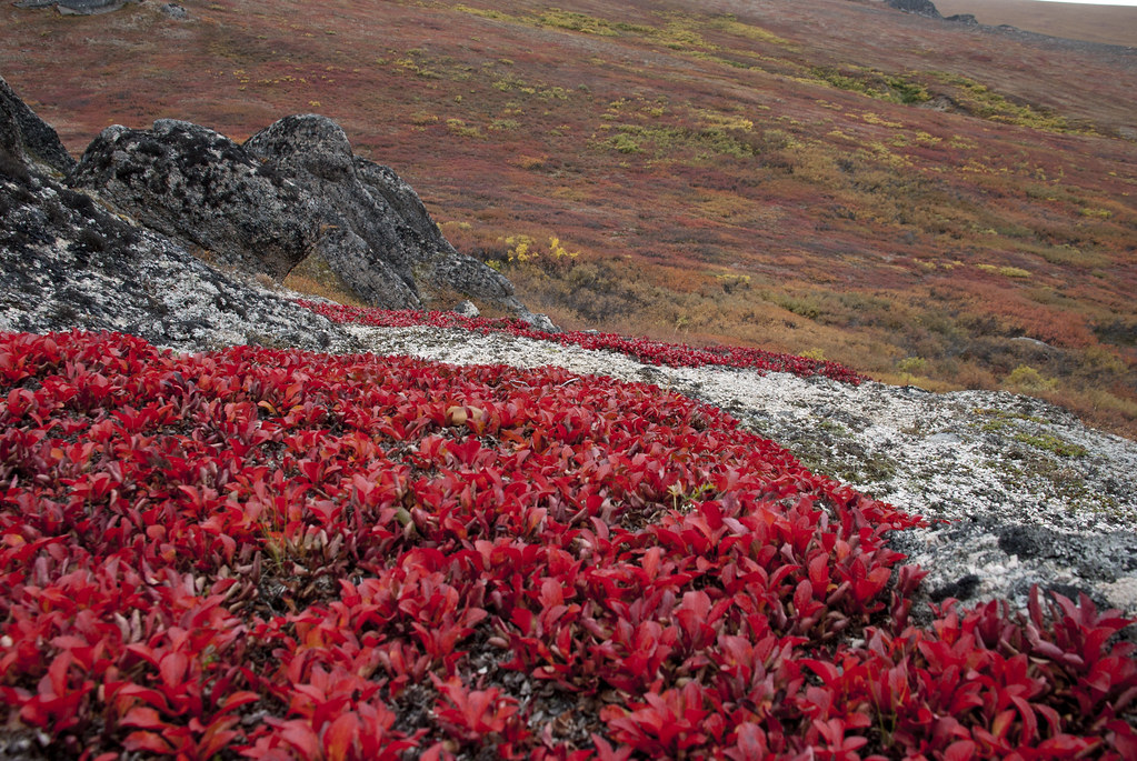
For the initial sketches, the Museum’s staff and I sketched many concepts, including dogsledding, aurora, snowshoe weaves, babiche, forget-me-not flowers, kaleidoscopes, networks, salmon streams and watersheds.


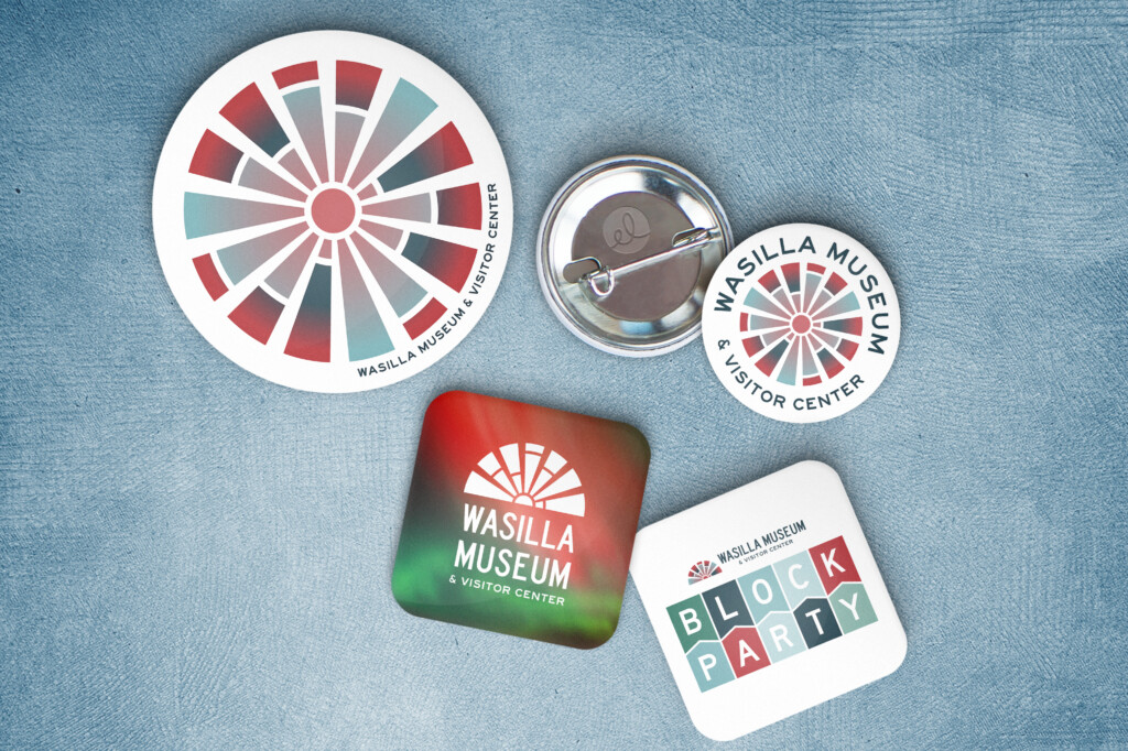
Context & Swag
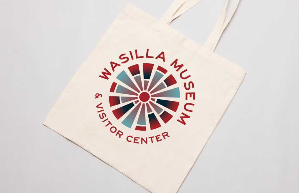
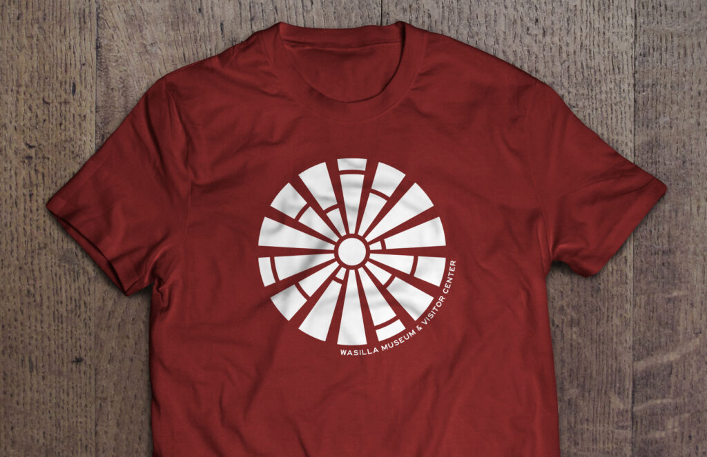
To provide context to the reviewers of my designs, I created Photoshop mockups with the logo designs in use on hoodies, shirts, totes, and buttons: applications of the design from small to large, full color to black and white. The mocked up images also include some key colors from the designs to spark conversation and show the color palettes in context.
Many visitors pick a souvenir to remember their Alaska visit from the Museum shop, so I wanted the mockups to reflect actual merchandise that could be produced. Staff at the Museum also wear branded merch, so shirts are always a helpful visual reference.
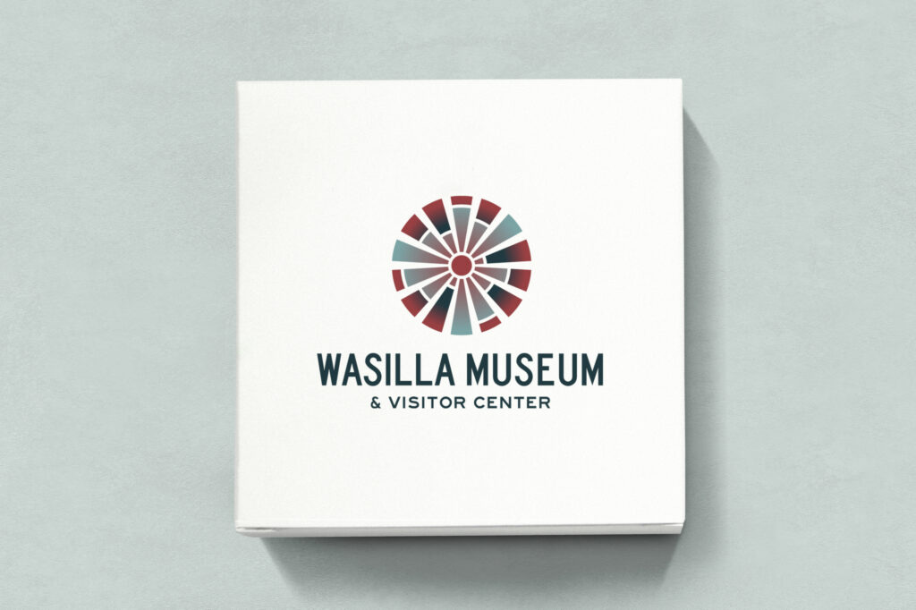
Final Design & Branding Guide
After reviewing and sharing the design drafts with stakeholders including the City of Wasilla executive staff, we arrived on a radial design with cool blues and a strong red as an accent color paired with an easy-to-read sans-serif font reminiscent of road signage, fitting for the Museum’s geography. After final edits, I designed a whole family of logo lockups for use across print and online media, as well as color codes and typography. My goal is that the Wasilla Museum team can confidently use their updated brand materials on everything they plan to make for the shop and on their social media accounts including Facebook.
I’ve been very lucky to work on other local museum organizational logos as well as museum programs and activities: check out my designs for Museums Alaska, My AZ Museum Journey, Museum of the Urban Desert, the Tikanni Pet Partners Program and the Palmer Museum’s kids’ activity book.